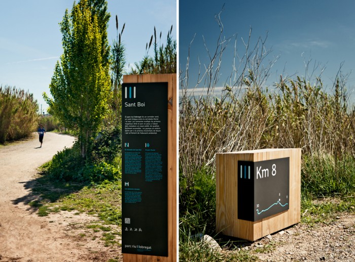
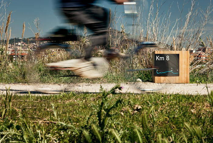
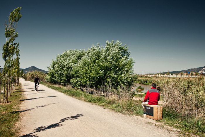
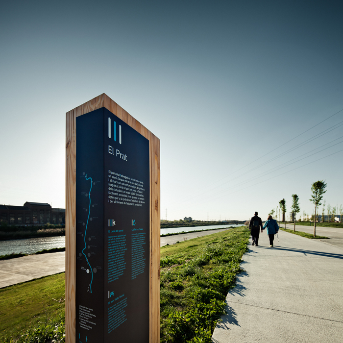
The challenge in designing a signage system for a riverside park that is over 30 kilometres long was to come up with signs that were both informative and useful but not intrusive. So we designed a series of wooden totems from local tree varieties which integrated naturally in the landscape. There are three different versions of the signs: the largest is 210cm high, used only at the access points to the park, and the smallest is the kilometre marker, which doubles up as a seat. The L-shaped metallic panel lends itself to having information on both sides, the narrow side being used for the map of the whole park.
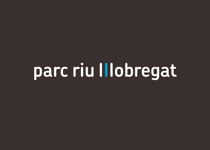
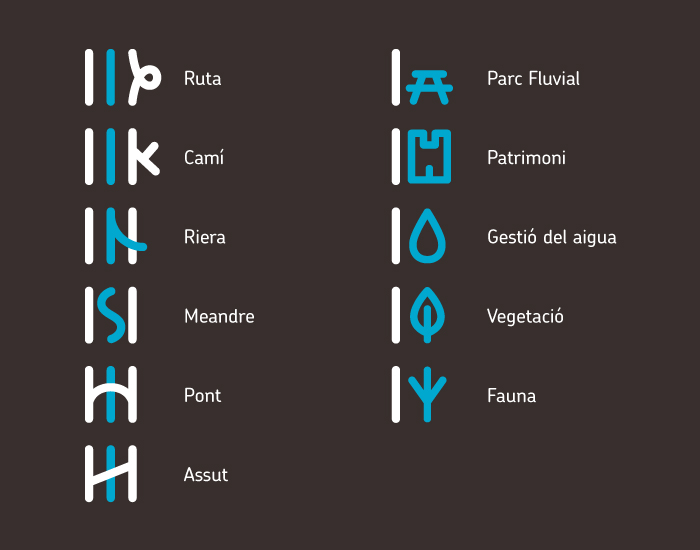
The Parc Ríu Llobregat branding comes from a logo based on modifying the double ‘ll’ of the river’s name, playing with the typography so that it becomes a visual synthesis of the river’s course with the two paths running either side of it the whole length of the park. This symbol engenders a collection of specific pictograms which identify the different informative panels. A mono-linear type-face was chosen to reflect the routes and paths the park offers, and some rounded shapes to convey a friendly, playful tone. The use of blue and brown relate to the river and the land respectively.